Charlotte Partridge and Miriam Frink. Filed February 17, 1954. Journal Sentinel Archives
Last month, I wrote about the first part of the exhibition The Layton Art Collection: 1888-2013. I introduced the great Milwaukee businessman and art patron Frederick Layton, and touched upon the founding of the Layton Art Gallery. The first section ends with the death of Frederick Layton.
The second section, which is my favorite part in the exhibit, starts with Charlotte Partridge.
As you may know from reading Chelsea Kelly’s last blog post, the Milwaukee Art Museum is celebrating its 125th anniversary–-commemorating the big year with three exhibitions. The Layton Art Collection: 1888-2013 is the Chipstone Foundation’s contribution to this great celebration.
The exhibition, open through the end of the year, is located in the Museum’s lower level. It tells the story of the Layton Art Collection, and is divided into three parts: Frederick Layton and the Layton Art Gallery, Charlotte Partridge and Modernism, and American Paintings and Decorative Arts. Each of the sections represents a distinct period in the Layton Art Collection. I will devote one blog post to each period, since each is rich with objects and interesting stories.
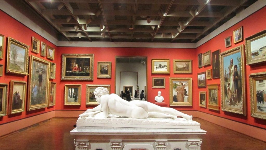
If you’ve been in the European galleries in the last few weeks, you’ve probably noticed a dramatic transformation in Gallery 10!
The gallery has been reinstalled as part of the celebrations of the 125th anniversary of the founding of the Layton Art Gallery, which laid the foundation for what would become the Milwaukee Art Museum. We’ve decided to call it Mr. Layton’s Gallery, after Milwaukee philanthropist Frederick Layton, who started it all.
Installation shot “Grete Marks: When Modern Was Degenerate.” Photo by the author.
Well, that was a whirl! For any of you that follow these blog posts in a timely manner, you’ll know (and one of you even pointed out to me in a gallery talk!) that I ambitiously scheduled two “Making an Exhibition” blog posts for myself on the week of and week after the Grete Marks: When Modern Was Degenerate exhibition opened.
Mistake. So, here I am, three weeks tardy to my original plans, finding an afternoon to recap the excitement of putting together the exhibition in its final week, celebrating the opening of the exhibition, and then sharing it with tours and reporters.
I am thrilled with how the beautiful artwork and tremendous story unfold in our exhibition. I am happy to report that we had a great crowd at our opening night. And I have been honored to share this story with more than one reporter, who had very lovely things to say about our exhibition in the press.
A “visual checklist” pinboard at my desk. Photo by the author.
Picking paint colors. Stepping under ladders in closed off galleries. Artfully arranging teacups. All are things I’ve done in the past few weeks, and all are entirely fun perks to a curator’s job. Beyond the fun, what I aim to do in this post is go a little deeper into the process of installing, painting, and arranging an exhibition.
In the first three posts of this series, I’ve addressed steps to developing the Milwaukee Art Museum’s Grete Marks: When Modern Was Degenerate exhibition (on view September 6, 2012 – January 1, 2013), from idea to loan paperwork to marketing.
The next step of bringing this incredible story and artwork physically to the public were the conversations we had about the design of the gallery, because there are as many ways to display artwork as there are paint colors in the Sherwin-Williams sample book.
“Grete Marks” exhibition committee formal proposal, front page.
In the first two posts of this series, I’ve addressed the origins of the Milwaukee Art Museum’s Grete Marks: When Modern Was Degenerate exhibition (on view September 6, 2012 – January 1, 2013). The exhibition went from my admiration of a certain artwork I didn’t know well, to years of background research to learn the context and nuance of the artist’s story.
In those steps, I looked at artwork, read about Bauhausian ideas, and traveled to Berlin and London to meet with curators and examine stunning teapots. For the next part of the task of making the exhibition, I mostly sat at a computer in Milwaukee generating forms and writing emails.
An exhibition goes from a curator’s idea to a museum reality through a series of approvals up the chain-of-command. To bring my personal research on Grete Marks into a real Museum exhibition, I first spoke with my curatorial colleagues and the Museum’s Chief Curator about the idea.
“Grete Marks” display at the Jewish Museum Berlin. Photo by the author.
As I moved through the stages of putting together the Milwaukee Art Museum’s Grete Marks: When Modern Was Degenerate exhibition (on view September 6, 2012 – January 1, 2013), I began by researching the designer through secondary literature and compiled a list of 417 Grete Marks ceramics and watercolors in institutional collections.
Those tasks I could do mostly from my office in Milwaukee, thanks to great library services and generous colleagues at other institutions.
However, to build relationships with curators for borrowing artwork, to meet with Grete Marks’ daughter Frances Marks, and to personally examine objects so that I could make informed decisions about which of the ceramic vessels we might want to request for loan to our exhibition, I needed to take a research trip to London and Berlin.
It was a tough job, but someone had to do it…
While researching in England, I made visits to “store” (Brit speak for “storage”) to see artworks at the Victoria & Albert Museum, The British Museum, and the National Museum in Wales. Those institutions have in their collections gifts from the artist herself, as well as from her husband, Harold Marks, and her daughter, Dr. Frances Marks (as do the Potteries Museum and the Museum at Wales’ Prifysgol Aberystwyth University, which I did not visit).
The Museum’s current exhibition Posters of Paris: Toulouse-Lautrec and his Contemporaries features a number of posters by Pierre Bonnard (French, 1867-1947)—including the fantastic France-Champagne lithograph, a work that inspired the master Henri de Toulouse-Lautrec to make ground-breaking posters.
Did you know that the Museum’s Permanent Collection has two paintings by Bonnard?
The paintings are gorgeous, and can be found on the upper level in the Bradley Collection Galleries.
One of the two paintings, Girl in Straw Hat (Femme au Chapeau Rouge), has long been one of my personal favorite artworks. I suspect that Girl in Straw Hat was also one of Mrs. Bradley’s favorites, and there is good reason why.
Jules Chéret, (French, 1836–1932), L’Horloge: Les Girard, 1875/1878 or 1880/1881. Color lithograph. Collection of Jim and Sue Wiechmann. Photo by John R. Glembin.
Even though the exhibition Posters of Paris: Toulouse-Lautrec & His Contemporaries may be billed as a fine art retrospective, it also serves as the largest and most extensive graphic design exhibition Milwaukee has ever seen. Featuring posters from the turn of the 20th century, Posters of Paris hearkens back to the roots of the profession. The artworks are situated at a time before “graphic design” was a legitimate term, but well after the world started recognizing the power of arresting visual communication.
And the line-up curator Mary Weaver Chapin has pulled together is impressive. The exhibition includes works by who I’d call the godheads of posters–Jules Chéret and Henri de Toulouse-Lautrec to Leonetto Cappiello and Alphonse Mucha. For a casual observer, or a trained graphic designer, there’s no shortage of exuberant eye candy to indulge in.
Posters of Paris will likely leave you drooling for days.
Face Jug, 1860-1880. Chipstone Foundation. Photo by Jim Wildeman.
Last month I wrote about the Chipstone Foundation’s new acquisition, an early Edgefield face jug with writing on the back. Since then, our curatorial team has uncovered the meaning behind the elusive inscription. Before revealing this discovery, I’ll catch you up on new research for Face Jugs: Art and Ritual in 19th-Century South Carolina, on view until August 5 at the Milwaukee Art Museum.
“Face jugs” is a term created by art historians, historians and archeologists to refer to turned stoneware vessels with applied faces. The eyes and the teeth are made of kaolin, a white river clay that is one of the primary components of porcelain. You will notice when you visit the exhibition that there are also face cups and face pitchers.
Many different cultures have created pottery with faces or human elements, but the Edgefield face jugs are unique.


, L'Horloge: Les Girard, 1875/1878 or 1880/1881. Color lithograph. Collection of Jim and Sue Wiechmann. Photo by John R. Glembin.")
