

The exhibition currently on view in the Milwaukee Art Museum’s Bradley Family Gallery (through June 25) is How Posters Work. On Thursday, April 6, 2017, the museum hosted a program in conjunction with the exhibition called Local Luminaries: Poster Provocation. This gallery tour welcomed luminaries from the Milwaukee area to share their unique perspectives about the works in the show.
John Rieben, graphic designer and professor emeritus from the University of Wisconsin–Madison, could not be present for the program due to inclement weather. We are happy to share his thoughts below:
I would like to spend a few minutes talking about my design hero and inspiration, Josef Müller-Brockmann. I think the greatest of the poster makers were [Toulouse] Lautrec, Cassandre, and Müller-Brockmann. Müller-Brockman, however, was more than a poster maker. He was the leading protagonist of a new way of visual communication, which became a worldwide movement that affected virtually every designer in the profession and every commercial message. It became known as Swiss Design.
The father of Swiss Design was Ernst Keller who directed the Kunstgewerbeschule in Zurich in the early 1900s. He removed the study of art from the design curriculum seeing its aims and process having little relevance to contemporary communication. Among his originations was the use of the grid as a unifying organizational design tool.
When Josef Müller-Brockmann took over the directorship of the school, he injected the theories he had been developing during the 1950s, and the design world took notice. I think one can say that the school under his direction became the incubator of Swiss Design.
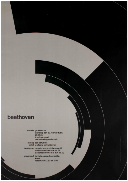
The timing of the movement was perfect catching the profession during a period of stagnation with excessive illustration, unstructured typography, and lack of logic and order. In this void, particularly in the U.S. where the modern movement had not made much impact, the Swiss dogma became widely accepted. The movement became a National Swiss export business.
The tenants of the program were simple to state, and perhaps not so simple to employ:
• A formal organization of the surface by means of a grid
• A distinct arrangement of typographical and pictorial elements by a predetermined priority
• Objective imagery that had little use for subjective expression
• Knowledge of the rules and a sensitivity that govern good typography
Helvetica became the industry-standard typeface, which had to be used exclusively. This is ironic since Müller-Brockmann’s font choice was Akzidenz Grotesk.
![Josef Müller-Brockmann (Swiss, 1914–1996), SCHÜTZT DAS KIND! [PROTECT THE CHILD!], 1953. Lithograph. 50 3/16 x 35 5/8 in. (127.5 x 90.5 cm). Cooper Hewitt, Smithsonian Design Museum, Museum purchase from General Acquisitions Endowment Fund 1999-46-1.](https://blog.mam.org/wp-content/uploads/2017/05/14691_a70ef8b5074deaf4_b.jpg?w=640)
Müller Brockman had a huge influence on a generation of young designers, and for me the influence was profound. Let me give you a little personal history that is only interesting because it began fairly early in the life of the movement.
I was born and grew up in Wisconsin in an environment that did not include things like design and art. I was drawn to art but the high school counseling at the time could only identify being an art teacher and architecture as a career choice. At university, math torpedoed any architectural ambitions and the direction of the information design curriculum was to prepare design directors for Detroit ad agencies. I don’t remember graphic design ever being discussed. For me nothing stuck.
Immediately upon graduating, Uncle Sam demanded my services and sent me to Europe and that is where my design education began.
I started to see things. During a leave I went to Switzerland to visit the home of my family. I stayed a couple of days in Zurich and was drawn to the poster kiosks, which were on every street corner throughout the city. There I saw examples of a design I had not seen before. Strong simple graphics with limited typography and images that demanded attention and introspection. I did not know it at the time, but I was experiencing Josef Müller-Brockmann’s work for the first time.

When I was mustered out of the army I found that I was unemployable, having no relevant skills or knowledge that employers required. So I made one of my best decisions. I went to graduate school. Even there I didn’t have a clue, but my major professor George Sadek put me out of my misery and directed me to concentrate on graphic design. In particular, he gave me a stack of books to read. The Bauhaus and the Modern Movement attracted my interest, but of greatest appeal were the Graphis annuals and magazines like Gebrauchgraphik, which published the kind of work I had seen in Zurich. I was able to put a name to the style: Swiss Design and its champion Joseph Müller-Brockmann.
Here I had found a direction that commanded my attention and most significant, something in which I could understand and maybe even experience a career.
At the time there was virtually no literature available about the Swiss design movement. In fact there were no available textbooks about graphic design. Miegs hadn’t come along yet and Joseph Müller Brockmann’s history of the posters, graphic design, and his grid system were still to be written.
So, in my last year in graduate school, in desperation, I set off for Europe with the purpose of finding the guys who were doing the kind of work I admired, and I determined to steal, borrow and beg from their “bag of tricks”.
In Zurich I went to the Kunstgewebeschule where I thought Müller-Brockmann was teaching but found that he was instructing at the Ulm school. It didn’t matter that much since the instructors and students were practicing the formal principles he had established, and I became a design sponge absorbing every bit of information into my empty head.

In the evenings while sitting in a beer hall on the Nederdorphstrasse with my design buddies, I learned the names of the leading designers in Zurich, and I set out to visit most of their studios. I surprised them by turning up unannounced but they were cordial and willing to show me their work. And of course I asked for examples of their posters. All in all I collected 35 or 40 posters from these sources, which made up a major part of my MFA exhibit when I returned to Indiana University.
I did meet the Master a couple of times, once in Hans Nuemans’s studio where one of the Neue Grafik issues was being put together. I was so inexperienced and intimidated that I don’t remember much of the conversation.
Language was a barrier, of course. Many of the young design students were interested in practicing their English since they were planning on going to Canada to work on the World Exposition. Their arrival in Montreal and their subsequent work in New York and Chicago were instrumental in spreading the gospel and popularizing Swiss style in the United States.
My first job was with Container Corporation of America in Chicago. I am certain I was hired because of my Zurich experience. The Swiss influence was being felt in Chicago and, as I recall, so recently that Helvetica was not yet available from the type houses.
I think that over the years I have retained those lessons and followed them in a fairly consistent manner. I still use a grid, fashioned for each particular assignment, I still use a very limited number of typefaces, and I use geometric and objective imagery to express the message of the client. I don’t like the term “Swiss Style” since to me it was more of a design philosophy than a style.
For a farm boy from Wisconsin with very limited design credentials, Joseph Müller-Brockmann and the Swiss School provided me with a way to see the world and enjoy a rich and exciting profession. And most important, have a lot of fun while doing it.
—John Rieben, in an email to Monica Obniski, Milwaukee Art Museum’s Demmer Curator of 20th and 21st Century Design, April 11, 2017
One reply on “John Rieben’s Homage to Josef Müller-Brockmann”
[…] Usonian Exhibition House Chair (previously featured on the Blog here), two new posters by John Rieben, and many other works of textile, metalwork, and industrial […]